Case Study · B2B SaaS · UX + Frontend

Alectio
Onboarding Redesign

Simplifying project setup for a B2B ML data-prep platform

UX Research User Flows Wireframing Frontend (Angular) B2B · Desktop
Role
UX Developer
(Design + Frontend)
Team
PM · ML Engineer
Frontend Engineer
Tools
Figma · Angular
Timeline
Multi-week
iteration
Before and after comparison of the Alectio onboarding redesign
Before Complex, sidebar-heavy layout with unclear hierarchy  →  After Guided step-by-step onboarding with top navigation
01 — Discover

Understanding where
users got stuck

Alectio's platform was primarily used by ML scientists and engineers on desktop. I conducted user interviews and walkthroughs of the existing onboarding flow to understand what motivated users, where they got stuck, and what slowed down project setup.

Methods: User interviews · Walkthroughs of the existing onboarding flow

I pulled out the repeated blockers across interviews and used them to prioritize which onboarding steps needed the most clarity.

Existing UI — critique Existing Alectio UI showing redundant data type selection

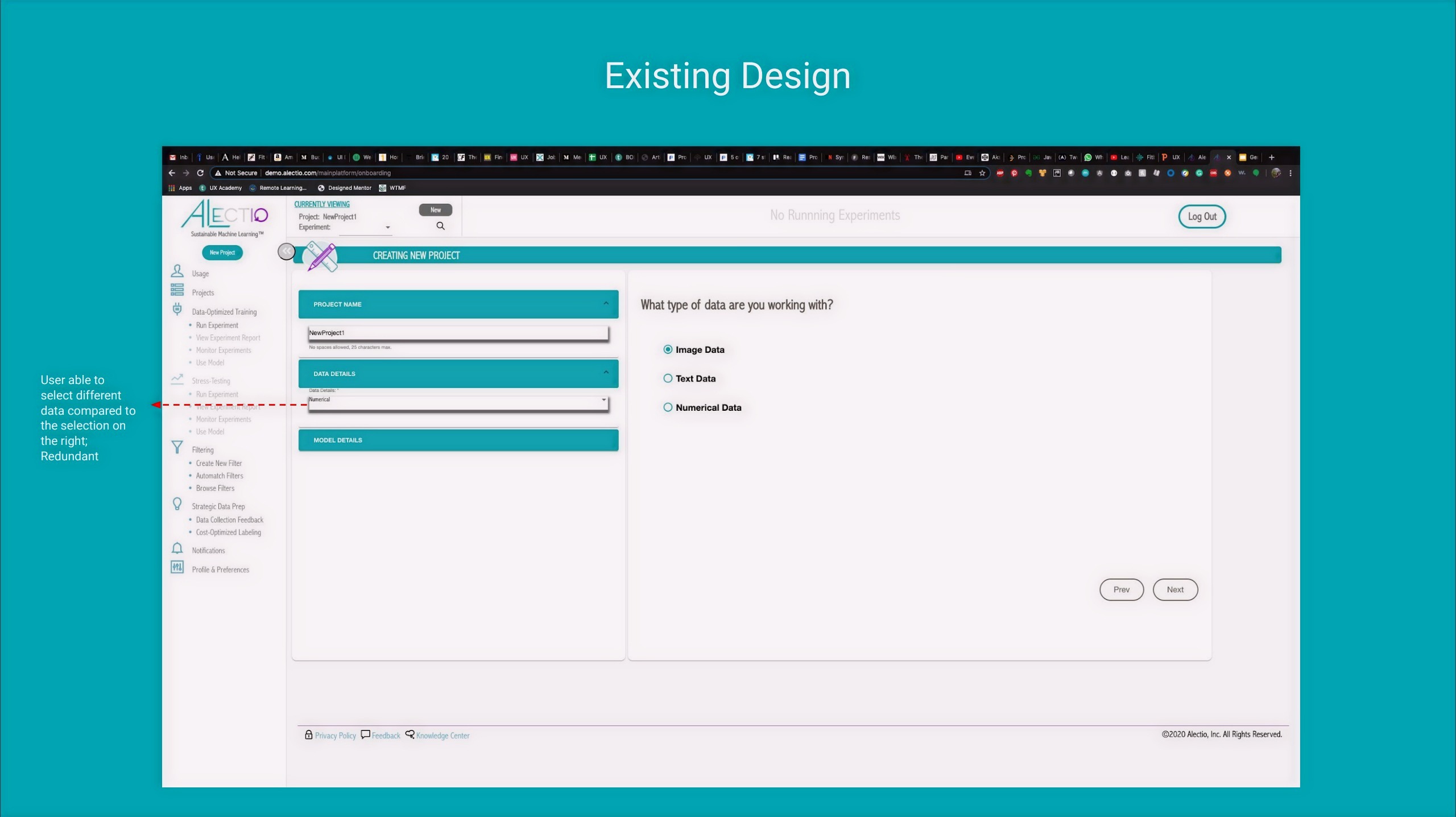
Redundant data type entry — users could select data in two places, creating confusion about which field was authoritative.

Model details missing from project summary

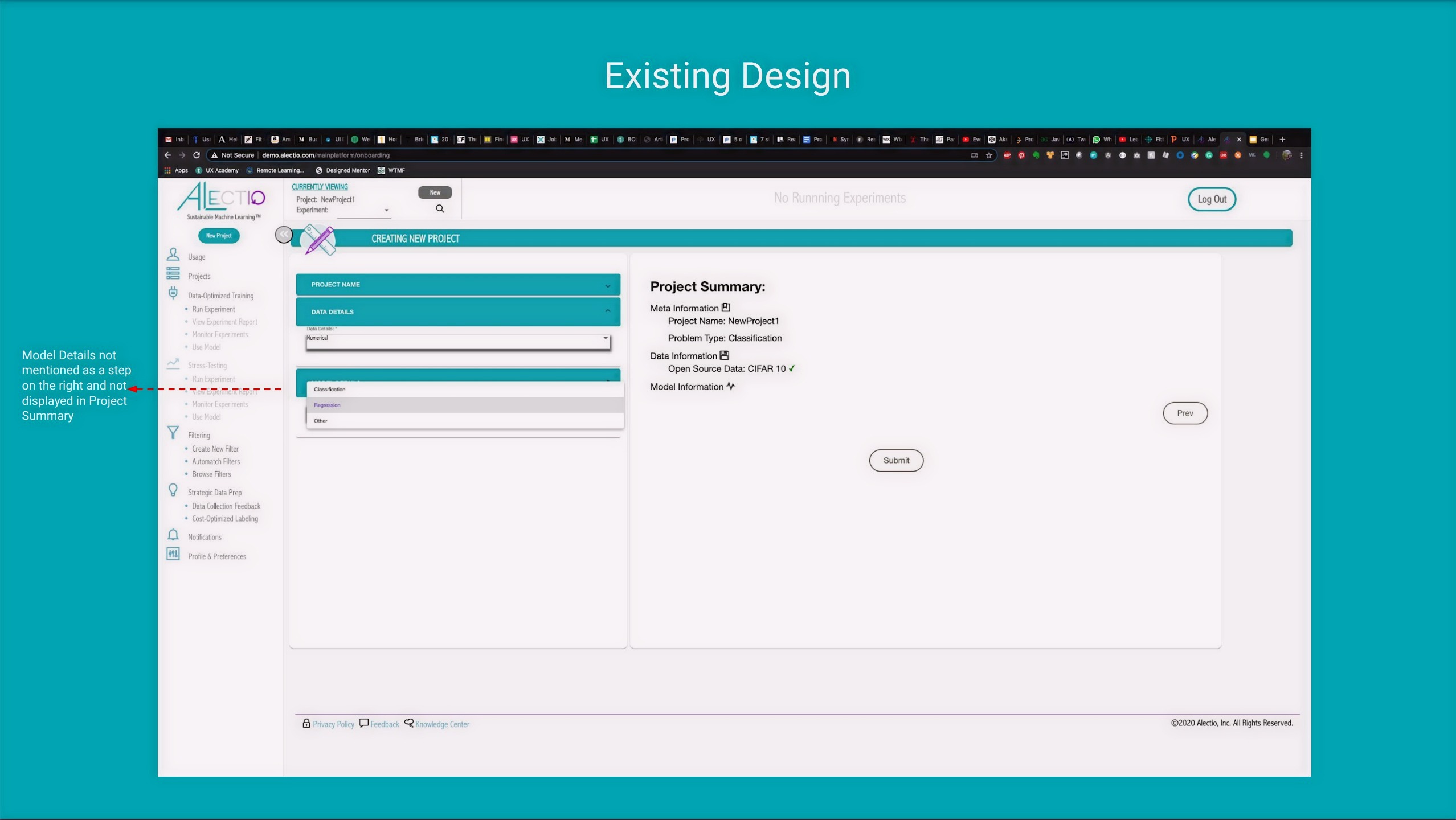
Model details not reflected in the project summary — users couldn't verify their selections before submitting.

Redundant project name fields

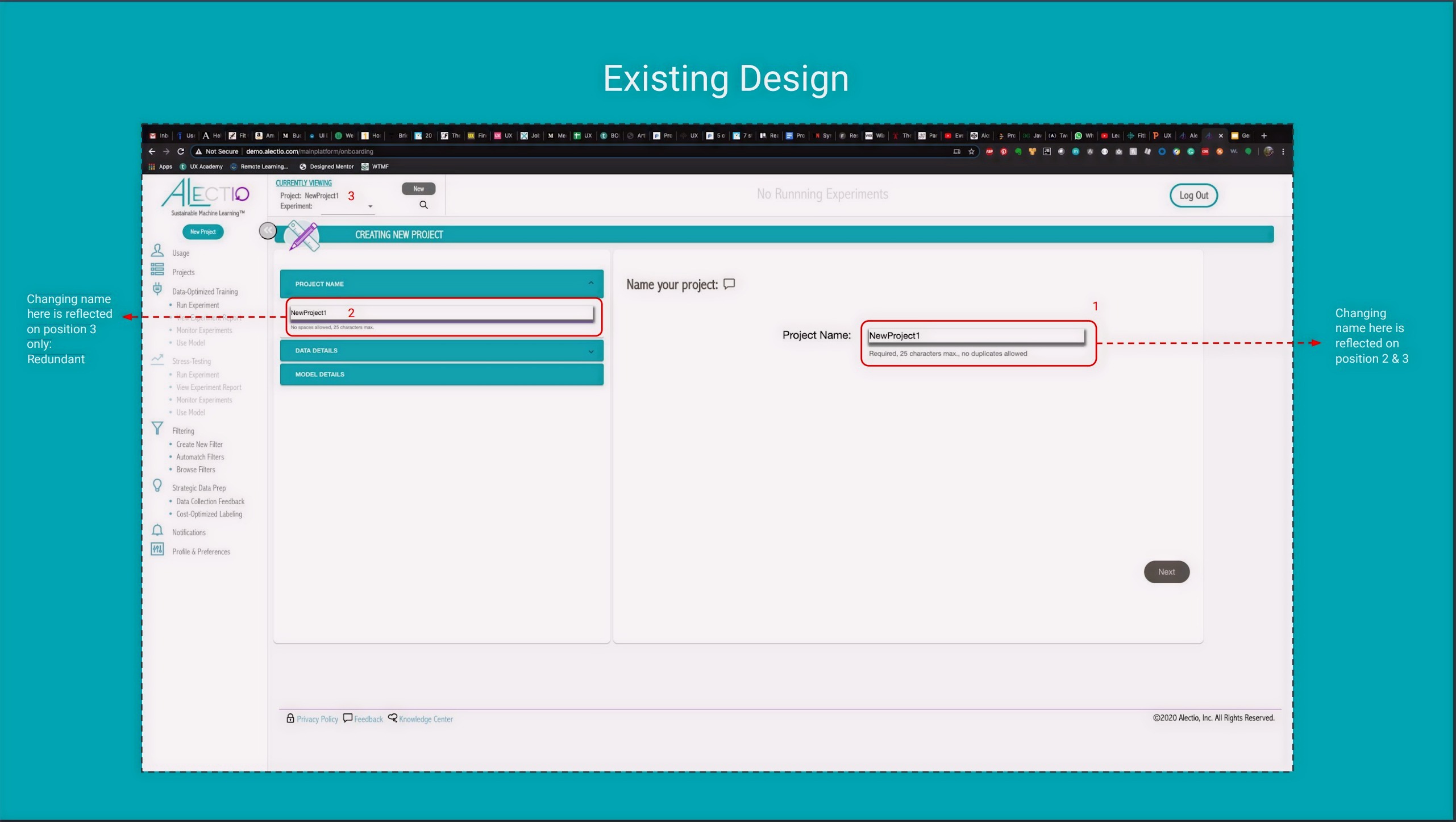
Two project name fields that updated independently — a confusing inconsistency that eroded trust in the interface.

· · ·

User Research — Key Insights

These themes highlighted where users lost time or confidence during setup and guided the onboarding changes we prioritized.

01
Users wanted a faster "time to first project" with fewer early decisions
Too many choices upfront created decision fatigue before users had even started.
02
Too many entry points and options made onboarding feel overwhelming
Multiple starting paths meant users weren't sure where to begin — or if they'd begun correctly.
03
Lack of progress visibility created uncertainty about what's next
No clear sense of how far along they were, or how many more steps remained.
04
Clearer labels and contextual help reduced confusion during setup
Small wording improvements had outsized impact on confidence during the flow.
02 — Define

Translating research
into direction

I translated research into a clear direction by defining success criteria and prioritizing the highest-impact areas. This helped align the team on what "better onboarding" meant for ML practitioners and what we would change first.

The goal wasn't to redesign everything — it was to reduce the number of decisions a user had to make before feeling oriented and in control. Design principle that guided the work
Step visibility
Master-detail progress
Users should always know what's done and what's next — no guessing how many steps remain.
Guided setup
Wizard-style flow
A single, sequential path with prefilled defaults where possible to reduce friction on each step.
Clarity
Tooltips + simpler labels
Contextual help and plain-language labels to reduce hesitation at every decision point.
03 — Design

Exploring two
redesign tracks

I explored two redesign tracks — platform layout and project onboarding — by mapping key flows and iterating through low-fidelity concepts with the team. With feedback from engineering and ML stakeholders, sketches and wireframes helped us quickly test structure, reduce cognitive load, clarify next steps, and converge on a guided setup experience.

Platform Layout Exploration

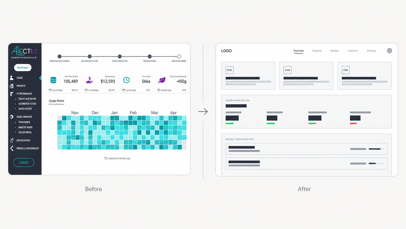
The existing UI relied on a sidebar packed with actions and lacked a clear hierarchy, while the top bar was underutilized. I explored a layout that elevated top navigation and grouped functionality into primary views — Dashboard and Projects — with user controls separated to the top right for faster access.

Updated User Flow Updated user flow diagram for Alectio onboarding

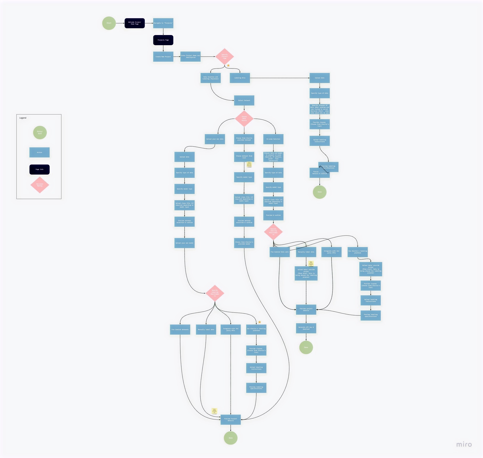
Mapping the full onboarding flow revealed where branching paths created confusion — and where a single guided path would reduce cognitive load.

· · ·

Onboarding Exploration

Creating a project is the entry point to most workflows in Alectio. The existing experience offered multiple starting paths and required too many decisions upfront — which made setup feel slow and error-prone. I used quick hand sketches to map out the proposed step-by-step flow before translating it into digital wireframes.

Early sketches — proposed onboarding flow Hand-drawn sketches showing the proposed onboarding flow across 6 steps

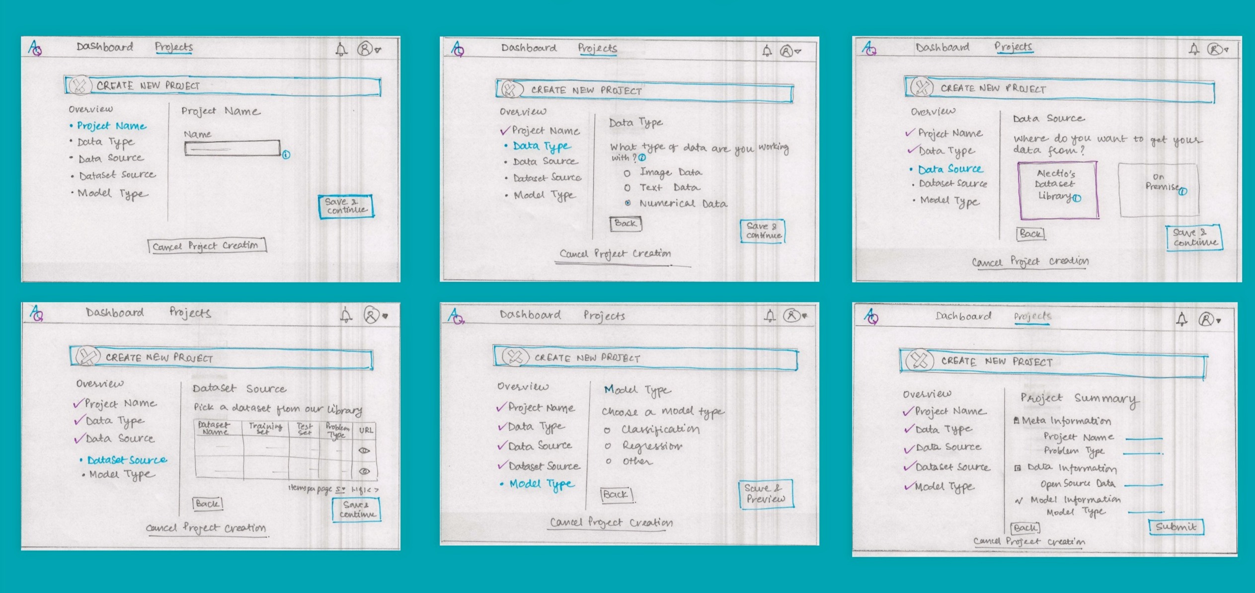
Six-step onboarding flow sketched out: Project Name → Data Type → Data Source → Dataset Source → Model Type → Project Summary. Each step surfacing one clear decision.

Digital wireframe — step 3 Digital wireframe showing Choose Dataset Source step

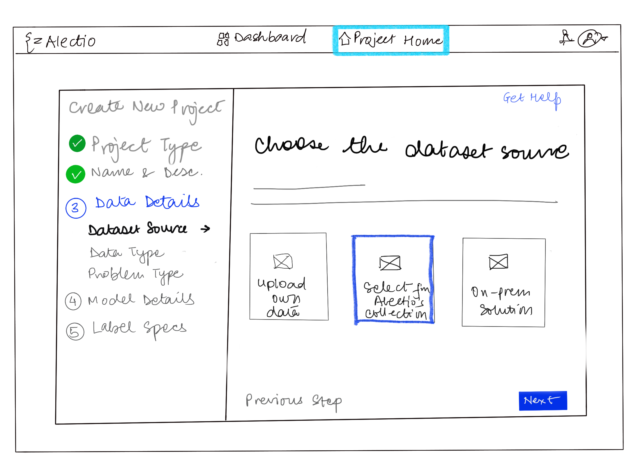
Choose dataset source — Alectio's library or on-premise. Clear visual options replace a dropdown buried in a form.

Digital wireframe — step 4 Digital wireframe showing Specify Labeling Classes step

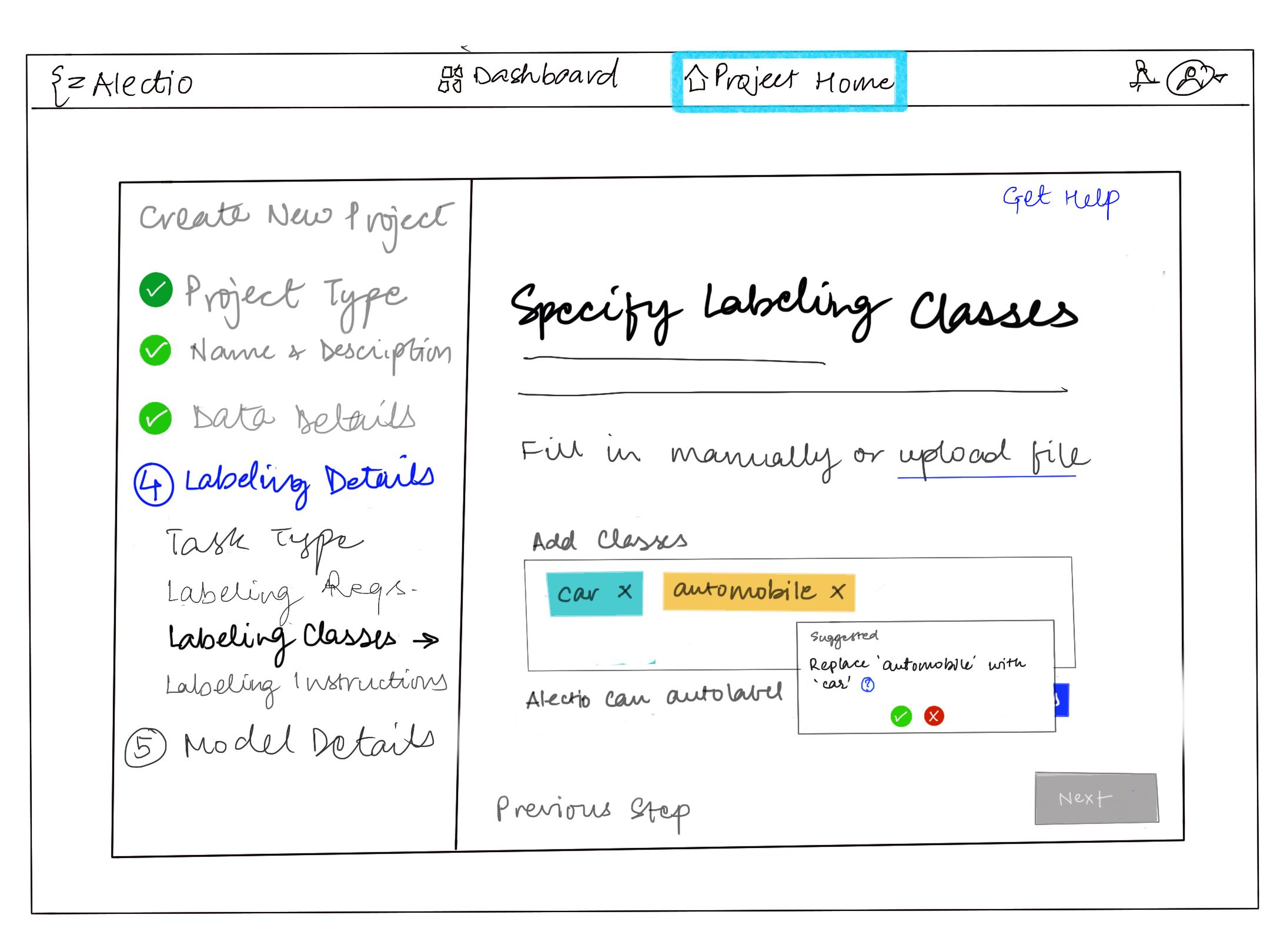
Specify labeling classes — fill in manually or upload a file. Tooltip helps users understand the impact of their choice.

04 — Deliver

Shipping the redesign

Note: Final high-fidelity visuals aren't included due to company access constraints — this case study focuses on flow, wireframes, and the shipped interaction changes.

I shared the refined flow and low-fi wireframes with the product designer for high-fidelity mockups, then supported implementation in Angular alongside the engineering team.

Final layout decision
Elevated top navigation, clearer hierarchy
Primary views (Dashboard / Projects) were easier to find, while user controls (notifications/profile) stayed consistently accessible in the top right.
Final onboarding structure
Guided setup with step visibility
A sequential wizard with clear next actions — designed to reduce hesitation and speed up project creation from the first session.
05 — Impact

Results

Post-launch outcomes — early user testing
4 / 5
Users completed project setup without needing assistance
Small sample; directionally positive
Reduced friction at the data source step — previously the most common point of confusion
Observed during walkthroughs
+
Positive post-launch survey sentiment, with one recurring ask: stronger value messaging at each step
Attitudinal · dashboard survey

We ran a short dashboard survey before and after the launch, asking users to rate statements on a Strongly Disagree → Strongly Agree scale. Post-launch feedback was mostly positive, with a clear request for stronger value messaging to help users understand the impact of their actions.

06 — Reflection

What I learned

Alectio was a turning point — moving from primarily front-end execution into a more customer-facing, UX-driven role where I helped shape what we built and why.

01
Working closely with a product designer and customer success helped me turn real customer feedback into clearer flows and better defaults — not just UI polish.
02
Partnering with ML engineers taught me to respect domain nuance and constraints while still pushing for simplicity and clarity in the experience.
03
I learned to look beyond the "happy path" by spotting hidden assumptions and expert workarounds — then designing onboarding that supports both new users and power users.
← Back to
All Work