Mobile app · Personal project · 2024
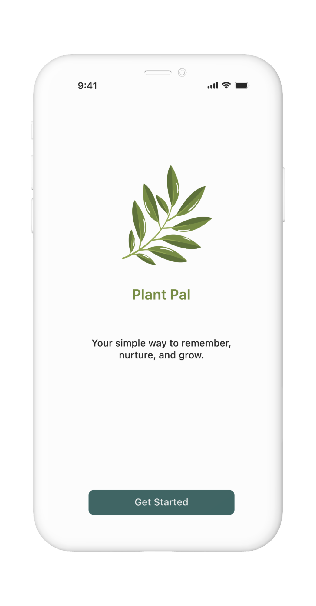
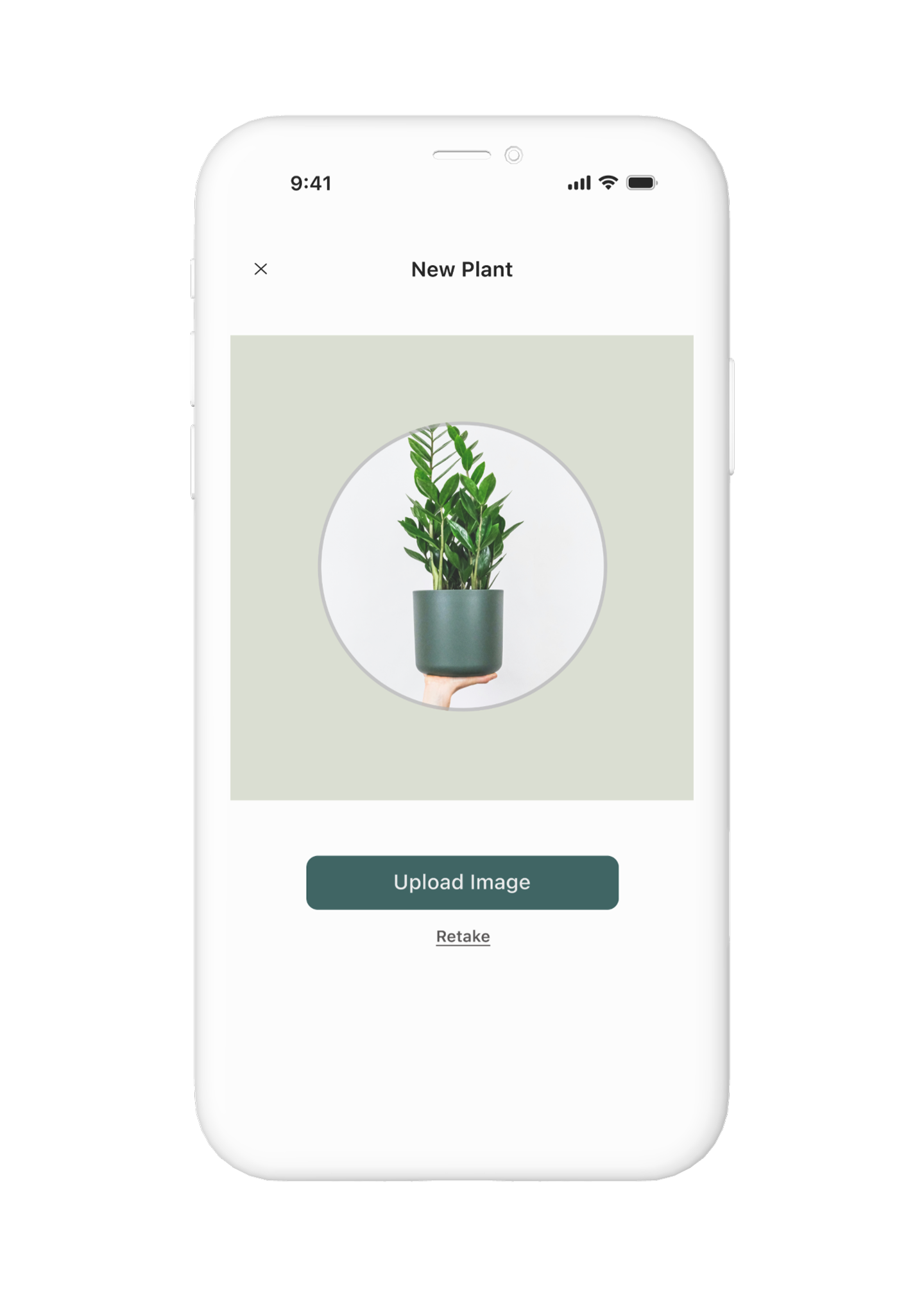
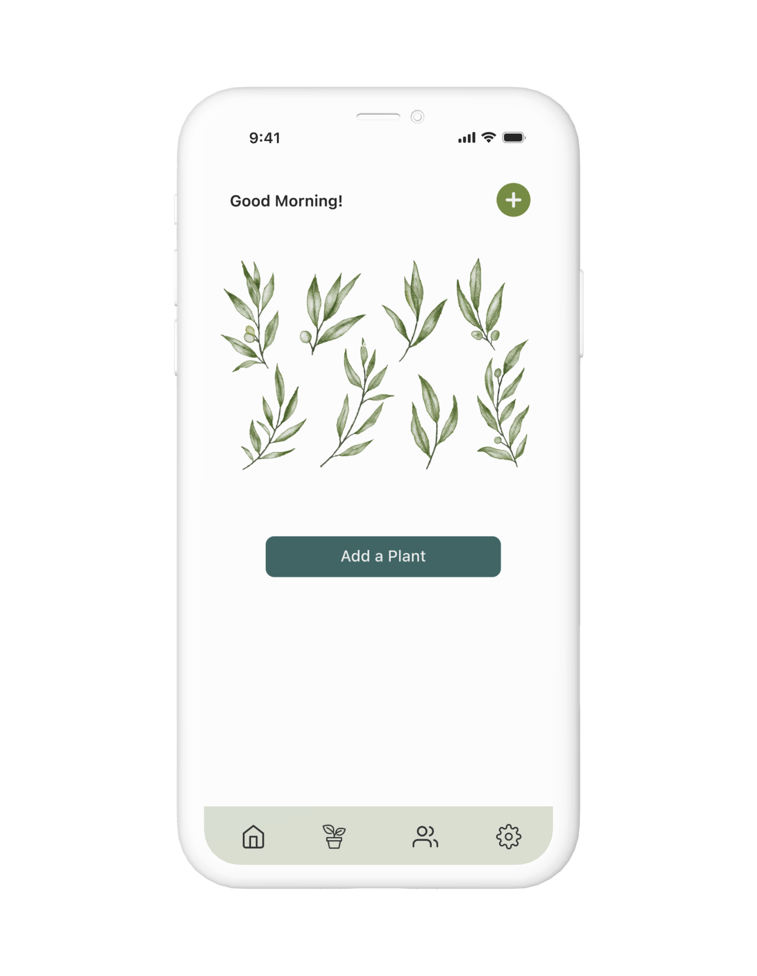
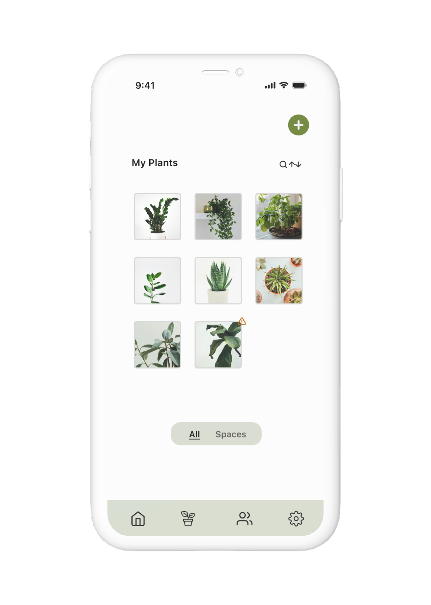
Plant Care
Companion.

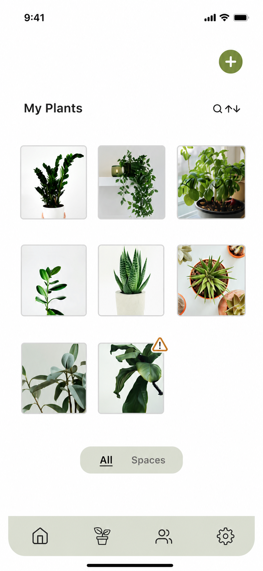
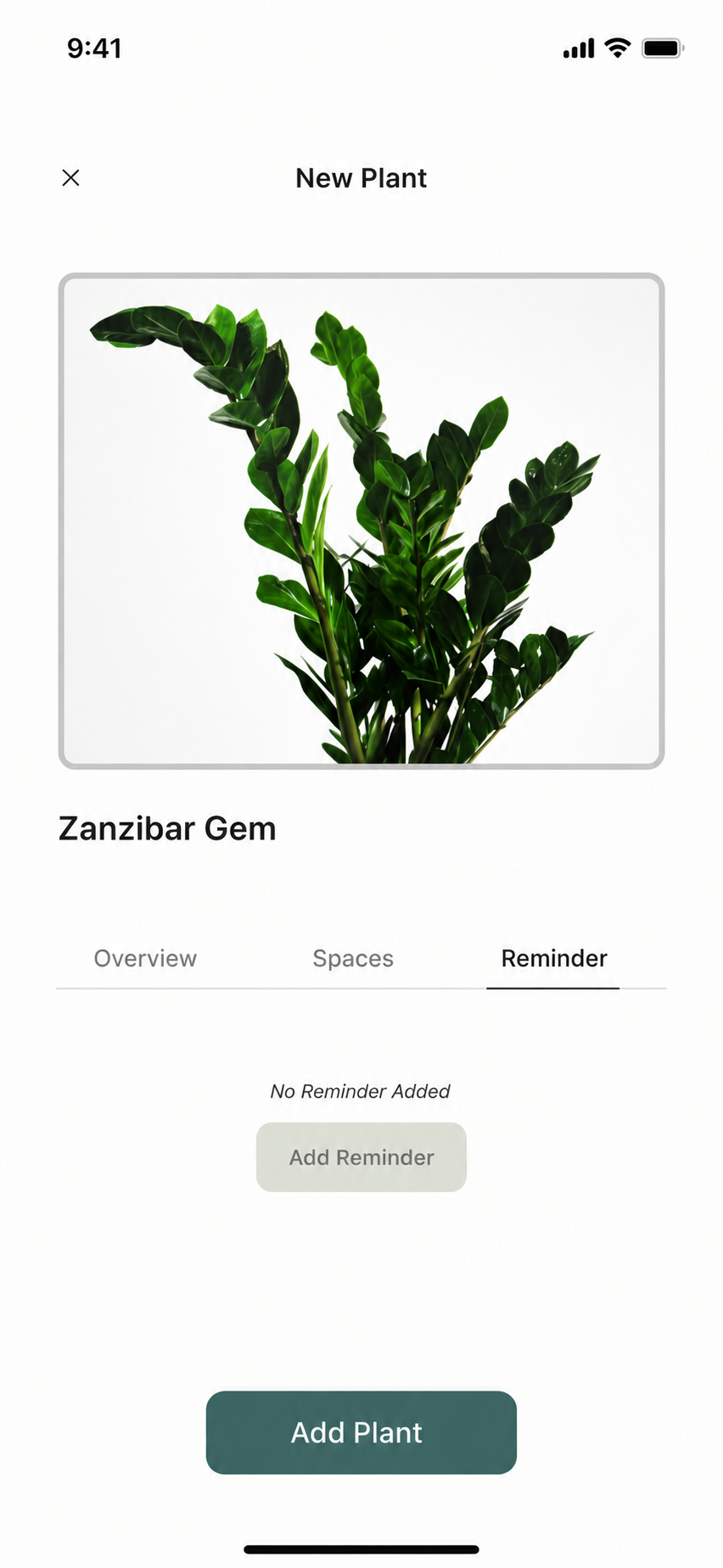
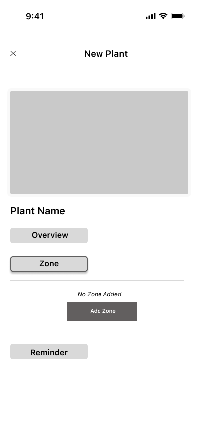
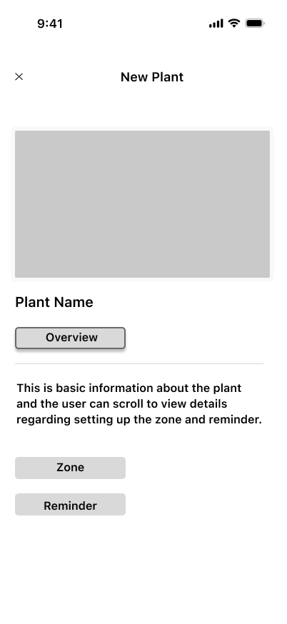
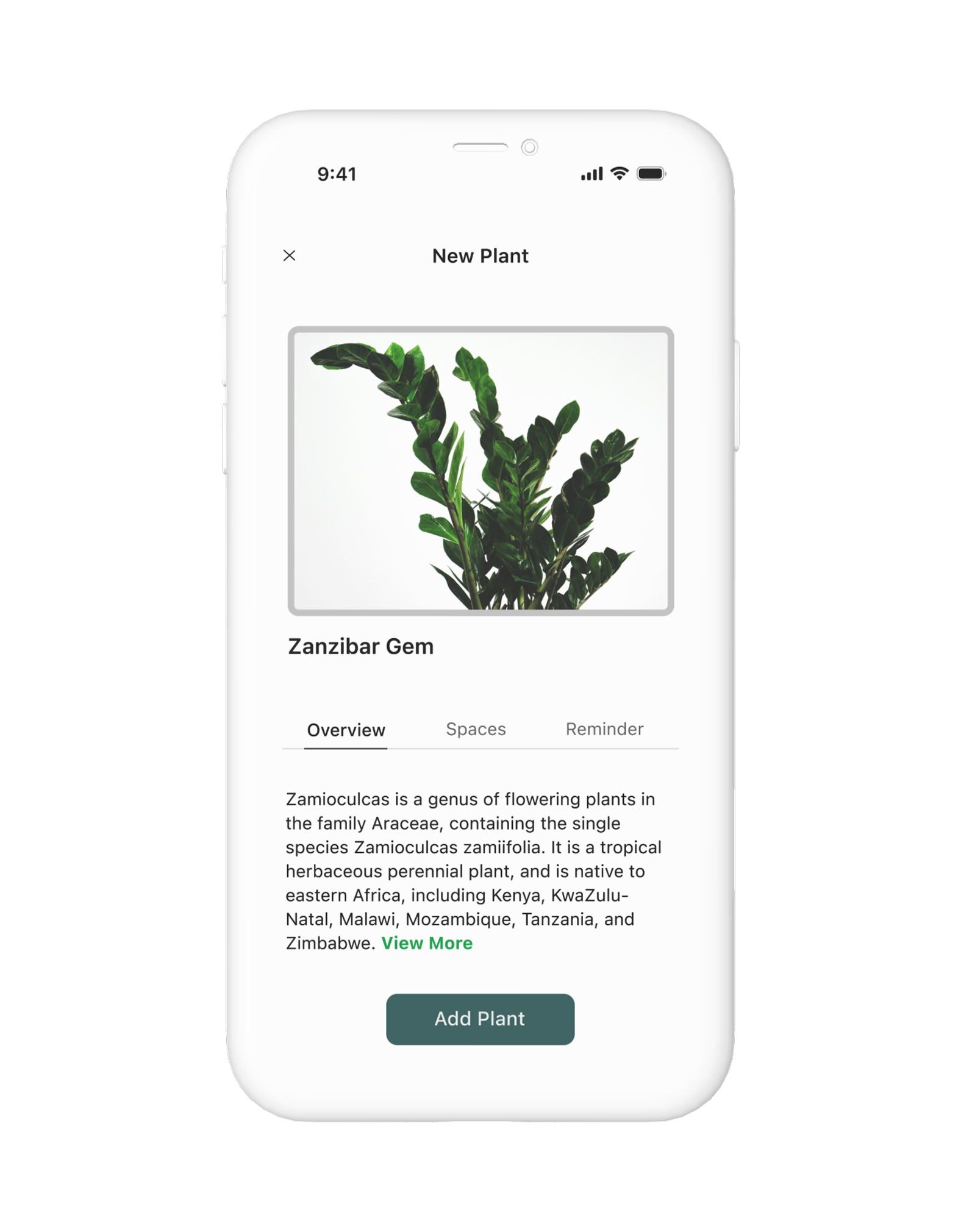
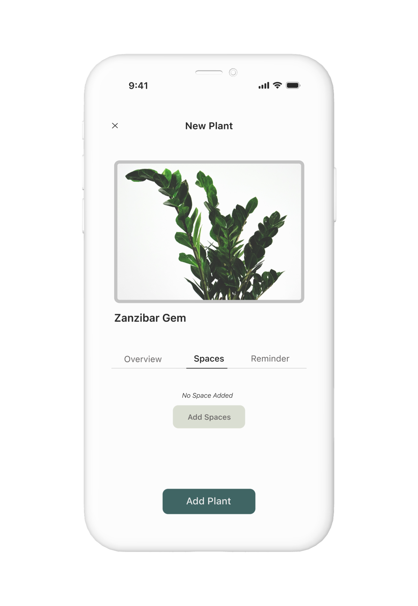
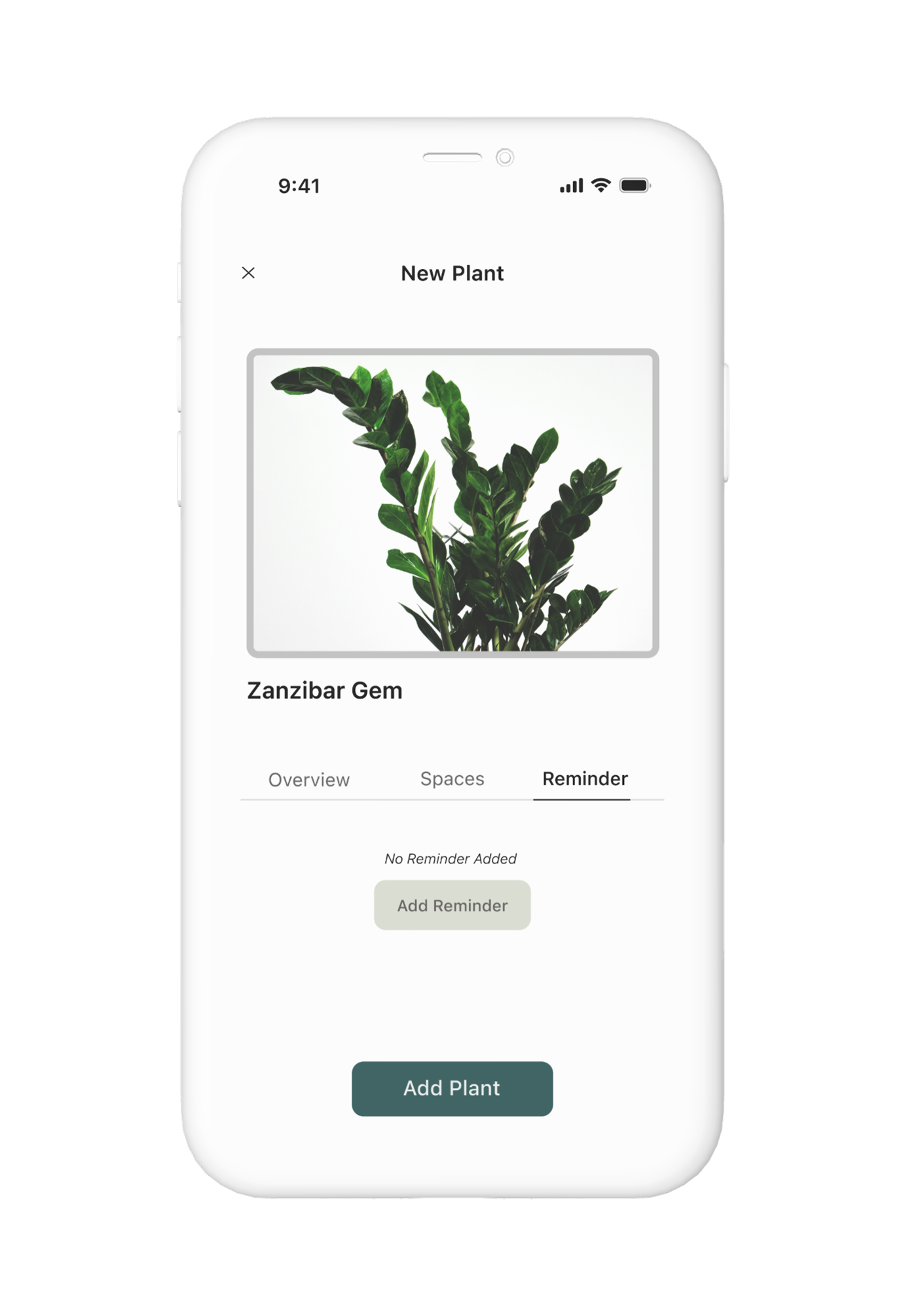
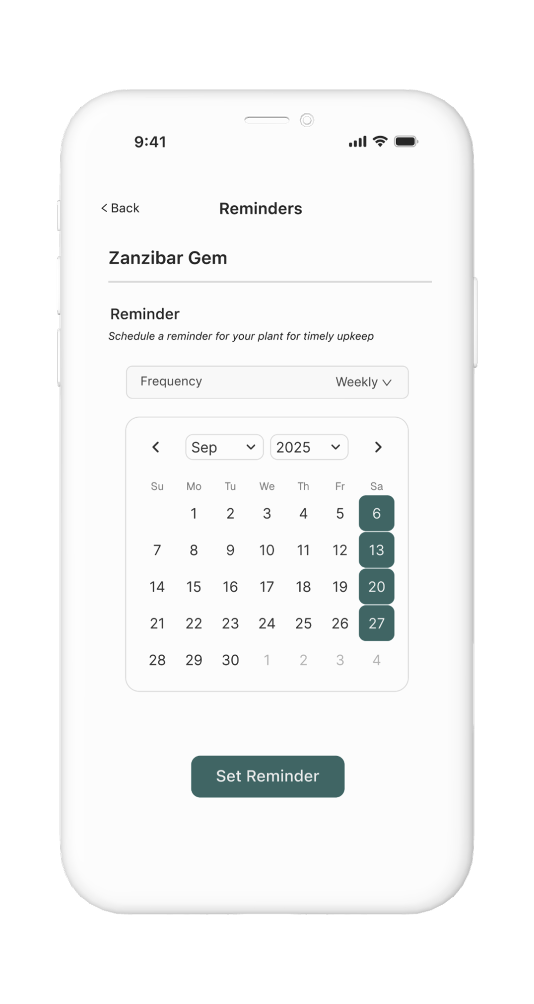
Designing a calmer, clearer way to care for plants — space-based organization, gentle reminders, and a tone that builds confidence rather than guilt.

View prototype
My Plants screen — Plant Care Companion app
Plant details with Reminder tab — Plant Care Companion app
Type
Personal project
Google UX Certificate
Platform
Mobile app concept
My role
UX Research
Interaction Design
Prototyping
Tools
Figma
Timeline
~6 weeks
Self-paced

Understanding how
people actually care.

To understand where plant care breaks down, I gathered qualitative insights from online reviews, community discussions, and AI-simulated 1:1 interviews. Five clear patterns emerged — and they shaped everything that followed.

01

Plant owners feel emotionally invested — and guilty when plants die.

02

Generic advice isn't actionable. People want guidance for their specific plant.

03

Conflicting information online creates overwhelm and indecision.

04

Gentle nudges work better than strict schedules or rigid reminders.

05

Visual cues help people act — more than rules or text-heavy instructions.


From patterns to
a clear problem.

With research insights in hand, I clarified the core problem and framed design questions to guide the work — focusing on routine, confidence, and simplicity.

Plant owners often struggle to maintain healthy plants due to forgetfulness, low confidence in their plant knowledge, and overwhelming or conflicting information online. Without clear guidance and supportive routines, plant care feels stressful instead of rewarding.

The problem statement pointed to four design directions — each one a question worth answering:

How might we

Make plant care feel simple and rewarding instead of stressful?

How might we

Help users build consistent routines by organizing plants by space — living room, balcony, bedroom?

How might we

Reduce overwhelm by surfacing clear next steps for each plant at the right time?

How might we

Support flexible reminders that adapt to a user's schedule and preferences?


Exploring structure,
making decisions.

I mapped the core flows — adding a plant, setting reminders, organizing by space — then explored layout options in wireframes before moving to high fidelity. Two decisions meaningfully shaped the final design.

Naming decision

"Zones" became "Spaces" — and that mattered.

Early wireframes used "Zones" to group plants by location. Feedback flagged confusion — users associated "zones" with gardening hardiness zones, a completely different concept. Renaming to "Spaces" (living room, balcony, bedroom) immediately clarified intent. I also removed a dedicated Zones screen to keep navigation lightweight.

The second decision was how to display plant details. I explored three layouts and tested them with a user — tabs kept the structure clean with core actions one tap away.

List
Chosen Wireframe — tab layout, chosen
Tabs — selected
Tiles

Feedback: the list felt too dense; tiles required more scanning. Tabs kept Overview, Spaces, and Reminder one tap away without cluttering the screen.


The final design:
calm, clear, confident.

With structure validated in wireframes, I moved into high-fidelity design. The visual language leans soft and natural — to match the emotional tone of the app. Every screen is designed to reduce friction and surface one clear next action.

Core flow — Add a Plant
Welcome screen

Welcome

Add plant — upload image

Add a plant

Plant details — Overview tab

Plant details

Optional setup — Spaces + Reminders

Users can personalize care during setup — or skip and come back later. No momentum lost either way.

Spaces tab

Assign to a Space

Reminder tab

Set a reminder

Set reminder — calendar

Reminder detail

Home — My Plants
Homepage — empty state

Empty state — first launch

My Plants — populated

My Plants — populated

Want to explore it?

Tap through the prototype.

Open in Figma

Keeping it
consistent.

To keep the UI coherent and document intent clearly, I defined local styles and reusable components — buttons, text fields, plant tiles, and tabs — including state variations and acceptance criteria for the Add Plant flow.

UI Foundations component sheet

To document intent for implementation, I wrote interaction notes and acceptance criteria for the Add Plant flow — covering edge cases, retry paths, optional steps, and post-success behaviour.

Developer handoff document — Add Plant flow
🎨
Local styles
Color and typography styles defined to support consistent components, states, and implementation-ready documentation.
🧩
Reusable components
Buttons, text fields, plant tiles, and tabs — each with variants for default, active, and error states.
📋
Handoff documentation
Interaction notes and acceptance criteria for the Add Plant flow — covering edge cases, retry paths, and post-success behaviour.

What I learned,
what I'd do differently.

What landed
The Zones → Spaces rename taught me how much a single word shapes perception. Naming is design.
Keeping setup optional — letting users skip and return later — made the add flow feel significantly lighter to test.
Defining a component system was a useful exercise in thinking through states and edge cases before they become implementation problems.
What I'd push further
More usability testing rounds — one informal session gave useful signal but isn't enough to validate the full flow.
The "Today's Reminders" home state deserves more design attention. It's the screen users see every day, and v1 kept it deliberately simple.
The emotional support angle — guilt, encouragement when a plant struggles — is the most interesting design space left unexplored.
← Previous Alectio Onboarding Redesign
✦ · ✦
Next → WhatsApp Polls